Panda CSS - The Origin Story
Segun Adebayo

Building Panda CSS was one of the most inspiring moments of my career; it reminded me of the period before launching Chakra UI.
I knew it would be very "Node" heavy, and I needed to learn more about Abstract Syntax Trees (ASTs). I was familiar with using basic modules like fs, path, and small bits of express to build APIs, but that was about it.
Creating a CSS framework that delivers a similar DX to Chakra UI, can be statically extracted, and can work in React Server Components felt like an exciting challenge.
Backstory
In June 2020, I published the first Request For Comments (RFC) for static extraction in the Chakra UI repo following the community request to improve the performance of Chakra UI components.
During this time, the Chakra team discussed whether to build the solution directly into Chakra UI or create a new project. Creating a Chakra-only solution didn't sound convincing to me for the following reasons:
1. Static Extraction cannot fully replace Dynamic CSS-in-JS
Most static systems require a set of rules or constraints to work reliably. In runtime CSS-in-JS, you can do things that would otherwise not work in a static system:
- write a function that returns non-deterministic styles
- pass styles based on the result of an API call
Going from dynamic to static requires a mindset shift that most Chakra UI users need to get used to and might be too much of a breaking change.
I read this article by Kyle (creator of Emotion) on Why he doesn't sell the idea of Static Extraction.

Kyle alludes to the fact that "CSS-in-JS is all about trade-offs", moving to static extraction handicaps the flexibility and dynamic features of CSS-in-JS. I totally agreed with these thoughts.
2. Supporting more JS frameworks
Chakra UI is largely a React-only project. If we were to invest efforts in a greenfield project, we would need to design it in a universal way that works for other JS frameworks like Solid, Vue, Astro and Svelte. This thought was primarily shaped and inspired by how Evan You built the Vite project.
3. Building bundler plugins can be tedious
If we went with a Chakra-only solution, we needed to create bundler plugins for Next.js, Babel, Rollup, Webpack, Vite, and more. It was too much of a leap from where we were given our knowledge and experience. It also felt like a never-ending tunnel of work to keep up with these bundlers.
Using Unplugin could get us pretty far, but it still didn't feel like the right approach at the time.
The Road to Static Extraction
Before deciding on the approach we were going to take, I explored existing solutions like Linaria, Vanilla Extract, and Atlassian's Compiled.

I was pretty fascinated by Vanilla Extract's approach, which allowed you to "configure your own styling system" and, out of that, create a dessert box for style-prop styling.
This approach felt similar to the initial design of Chakra's styling system, except that we designed a close system of props that was difficult to customize. It was clear that switching to an open, configurable system would be beneficial to our end consumers.
To get some initial insights, I contacted Mark Dalgleish (creator of Vanilla Extract and CSS Modules).
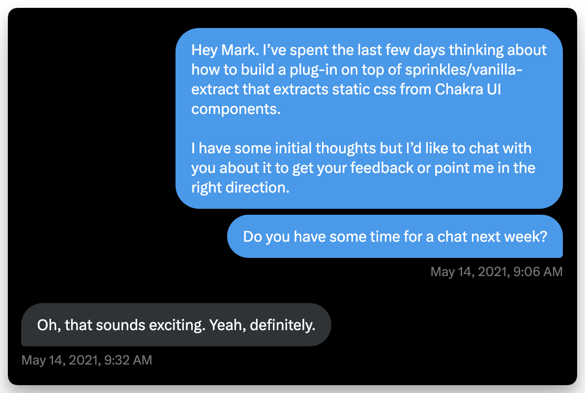
The intent of this meeting was to figure out how we could potentially use Vanilla Extract under the hood to build the first Proof-of-Concept (PoC) of the current Chakra UI styling engine.
Mark pointed out that due to the static limitations that might need to be imposed, it might be best to build this as a separate project to better manage DX expectations.
Building the Proof of Concept
I built a PoC using Vanilla Extract and got pretty comfortable with it, knowing how it worked internally and how it used TypeScript to infer the typings. It was a refreshing learning experience for me outside the Chakra ecosystem.
Here's a quick overview of the code I came up with.
import { defineProperties, createSprinkles } from '@vanilla-extract/sprinkles';
import { responsiveProperties } from './responsiveProperties';
import { fontSizePairings, lineHeights, fontWeights } from './typography';

const typographyProperties = defineProperties({
  ...responsiveProperties,
  properties: {
    fontSize: fontSizePairings,
    lineHeight: lineHeights,
    fontWeight: fontWeights,
    letterSpacing: letterSpacings,
    textAlign: ['left', 'right', 'center'],
  },
});

const displayProperties = defineProperties({
  ...responsiveProperties,
  properties: {
    display: ['none', 'flex', 'grid', 'inline-flex', 'block', 'inline-block'],
    alignItems: ['flex-start', 'center', 'flex-end', 'stretch'],
    alignContent: ['center', 'stretch'],
    justifyContent: ['flex-start', 'center', 'flex-end', 'space-between'],
    justifyItems: ['start', 'center', 'end'],
    flexDirection: ['row', 'column'],
    flex: ['0', '1'],
    flexShrink: ['0', '1', '2'],
    gridTemplateColumns: {
      '1': 'repeat(var(--grid-repeat, 1), minmax(0, 1fr))',
      '2': 'repeat(var(--grid-repeat, 2), minmax(0, 1fr))',
      // ...
      '10': 'repeat(var(--grid-repeat, 10), minmax(0, 1fr))',
      '11': 'repeat(var(--grid-repeat, 11), minmax(0, 1fr))',
      '12': 'repeat(var(--grid-repeat, 12), minmax(0, 1fr))',
    },
  },
});

// create css function
export const css = createSprinkles(typographyProperties, displayProperties);

// css usage
const className = css({
  fontSize: 'sm',
  lineHeight: 'tall',
  fontWeight: 'bold',
  display: 'flex',
  alignItems: 'center',
  justifyContent: 'center',
});
After using the `css` and `recipe` functions to recreate some components in Chakra, I noticed areas that were quite challenging to replicate with Vanilla Extract, namely our component theming systems and automatic RTL support.
Another project I found fascinating was Contentlayer, which provided a way to write typesafe docs by extracting markdown files. It automatically generates typings and JSON files from markdown content.
Ultimately, I set out to build a new project that merges ideas from Chakra UI with patterns from Contentlayer, Vanilla Extract, and Stitches.
The First Version
The first working prototype of Panda was called `css-jsx`. I didn't overthink the name; I just wanted to get started.
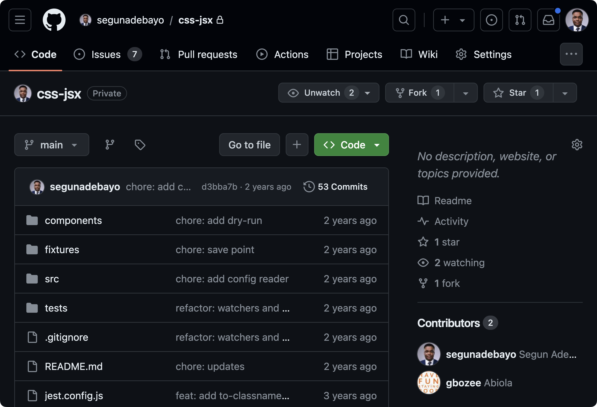
Shout out to Biola Oyeniyi for contributing to the initial version of
`css-jsx`.
This version aimed to build an engine that:
- included a compiler to extract style usage and style prop
- generates types from the config provided, reducing the need for TypeScript inference
- allows for flexible configuration of the styling engine
- emits atomic css for improved performance and style de-duplication
The initial compiler was built as a plugin for `@swc/core` and used `chokidar` to watch the file system changes.
At some point, the SWC project discouraged the use of JavaScript for plugins and was moving to Rust, so I reworked it to `ts-morph` and `ts-pattern`.
Here's the initial API for `css-jsx`:
import { css, globalCss, matchCss } from 'css-jsx';

// Define styles
const baseStyle = css({
  fontSize: '16px',
  color: 'black',
  '&:hover': {
    color: 'red.200',
  },
});

// Match styles based on props
const hoverStyles = matchCss(props.size, {
  sm: { color: 'red.400' },
  lg: { color: 'red.500' },
});

// Global styles
globalCss({
  body: {
    bg: 'gray.100',
  },
});
Next, I created the first draft of the configuration file for the system. The goals where to allow:
- customizing design tokens
- creating custom css properties
- control over the generated class and styles
Here's how the first version of the config looked:
// css-jsx.config.js
export default {
  files: ['src/**/*.tsx'],
  watch: true,
  properties: {
    bg: {
      className: 'bg',
      toCss(value) {
        return { backgroundColor: value };
      },
    },
  },
  theme: {
    breakpoints: {
      sm: '640px',
      md: '768px',
      lg: '1024px',
      xl: '1280px',
    },
    colors: {},
    fonts: {},
    fontSizes: {},
    fontWeights: {},
  },
};
The configuration file is consumed and emits JS functions that can be used to author styles. The emitted file structure looked like this:
- 📁 css-jsx
- css.js
- css.d.ts
- globalCss.js
- globalCss.d.ts
- matchCss.js
- matchCss.d.ts
This approach shifts the project from an NPM package you install to a customized module system that is generated by the CLI.
# Run the codegen to generate the css-jsx module
css-jsx codegen --outdir=css-jsx

# Run the cssgen to emit the css files
css-jsx cssgen --outfile=styles.css
Beyond the first prototype
At the Chakra offsite in 2022, I demoed the first version of Panda CSS. The team was excited and fired up to see a working prototype we could build on.

The team started using the PoC in several projects to find DX issues, bugs, and areas for improvement. It felt great to delegate parts of the project and keep everyone working harmoniously to polish it.
We built a rough looking playground for the browser to help us find and replicate bugs. The playground boosted the team's productivity and helped everyone understand how the system worked.
After many rounds of virtual calls with the team to polish the APIs in Panda, we landed on the following concepts:
1. Utilities
Configurable custom properties to style elements, such as mt and pt, and their generated styles.
`className`: the class name to generate in the DOM`property`: the CSS property to apply (for types)`values`: the design token category to use`transform`: a function to transform the value to css object
// panda.config.js
export default {
  utilities: {
    mt: {
      className: 'mt',
      property: 'marginTop',
      values: 'spacing',
      transform(value) {
        return { marginTop: value };
      },
    },
    bgColor: {
      className: 'bg',
      property: 'backgroundColor',
      values: 'colors',
      transform(value) {
        return { backgroundColor: value };
      },
    },
  },
};
Learn more about utilities from the Panda CSS docs.
2. Conditions
Configurable css selectors and media queries, like `_hover`, `_active` and more.
// panda.config.js
export default {
  conditions: {
    hover: '&:hover',
    focus: '&:focus',
    active: '&:active',
    disabled: '&:disabled',
  },
};
Learn more about conditional styles from the Panda CSS docs.
3. Recipes
Authoring style variations for a component
const buttonStyles = cva({
  base: {
    display: 'inline-flex',
    alignItems: 'center',
    justifyContent: 'center',
  },
  variants: {
    size: {
      sm: {
        fontSize: 'sm',
        px: 2,
        py: 1,
      },
    },
  },
});
Learn more about Recipes from the Panda CSS docs.
4. Layout Patterns
Primitives for managing layouts like `stack`, `hstack`, `vstack`.
<div className={stack({ gap: '2' })}>
  <div>1</div>
  <div>2</div>
  <div>3</div>
</div>
Learn more about Layout Patterns from the Panda CSS docs.
At this point, it was clear we were pretty close to a good design for Panda. The team was excited about the possibilities and the potential of the project.
Building the Team
To ensure the sustainability and growth of the project, I knew I needed to build a team around Panda CSS. I wanted to build a team that was passionate about the project and could contribute to its growth.
Improving the Compiler with Alex
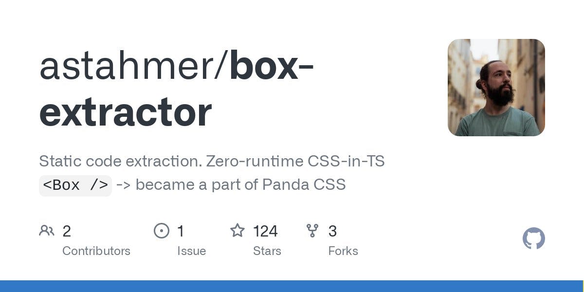
I stumbled on Alexandre Stahmer's tweet about a project he was working on, Box Extractor.
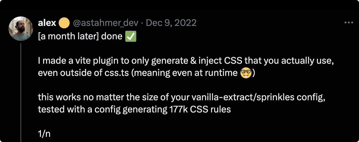
Box Extractor was designed to be an optimizing compiler for Vanilla Extract's Sprinkles. It was built to solve a common issue with Vanilla Extract's sprinkles which pregenerates a lot of styles leading to large CSS bundle sizes.
I experienced this issue while building the first PoC with Vanilla Extract. It felt a good match to reach out to Alex and see if we could collaborate on the compiler part of Panda.
I looked at the source code and found that Alex used the same toolset and strategy for the compiler.
`ts-pattern`for matching nodes in the AST tree`ts-morph`for walking a TypeScript AST and extracting symbols and types
I reached out to Alex on Twitter to discuss the possibility of a collaboration.
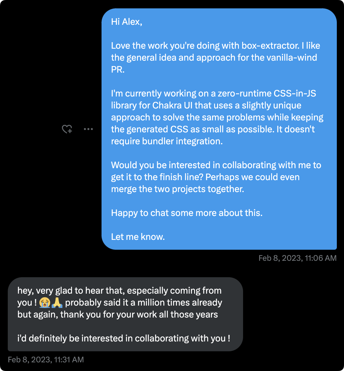
After a first call with Alex, he was convinced that Panda had a better API design overall and was excited to collaborate. The core logic of box-extractor was merged into Panda's codebase.
It's incredible how much work Alex and I have done together over the past months, which all started with a single DM. I've learned to always reach out and ask for help.
Today, the compiler has been significantly improved to handle a lot of robust scenarios and edge cases.
Polishing DX with Chris
Chris quickly became a super user of Panda, even though it was still unfinished and buggy. He loved the new possibility it brought to the dying CSS-in-JS landspace.
Chris challenged me to push the DX to the extreme by improving support for JSX Style Props. His real-time feedback and suggestions helped shape the API and the project's direction.
Shortly after, I added support for JSX Style Props to Panda, which allowed users to write styles directly in JSX.
import { Box, Stack } from 'styled-system/jsx';

function App() {
  return (
    <Stack>
      <Box color="pink.500">Item 1</Box>
      <Box bg="red.200" p="4">
        Hello World
      </Box>
    </Stack>
  );
}
We ended up with a concept of "function-JSX" duality. This meant that everything you can do with the function API, you can do with JSX.
Here's the function equivalent of the above JSX code:
import { css } from 'styled-system/css';
import { stack } from 'styled-system/pattern';

function App() {
  return (
    <div className={stack()}>
      <div className={css({ color: 'pink.500' })}>Item 1</div>
      <div className={css({ bg: 'red.200', p: 4 })}>Hello World</div>
    </div>
  );
}
This feature was a game-changer for Panda CSS and opened up a new world of possibilities for users.
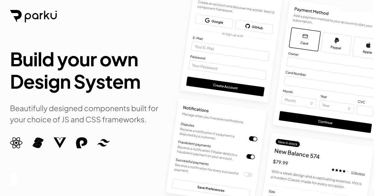
Chris started a new project, Park UI, to showcase the power of Panda CSS when combined with our headless component library, Ark UI.
Planning the Launch with Esther
Esther played a crucial role in planning the launch of Panda CSS. She designed a captivating launch video, getting started videos and drafted the initial set of announcement posts.
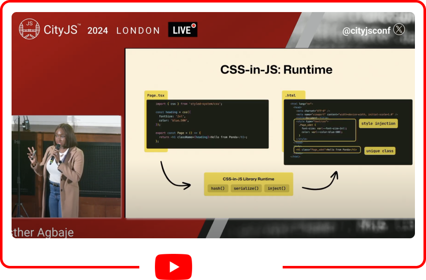
As our Developer Advocate, Esther shares valuable content about Panda CSS, and creates video tutorials to help the community better understand how to build faster with Panda.
Watch Esther's talk about Panda CSS at the CityJS London 2024.
Esther is working on a deep dive course for Panda CSS. Stay tuned for more updates on that.
Managing the release with Abraham
Abraham is an exceptional release manager for the project. He manages all release and changelog related activities to allow Alex and I focus on project development.
He's meticulous and organized when it comes to releases, making him an invaluable asset to the team.
Abraham understands the significance of post-release activities. He tweets about project updates, and collects feedback from users on Discord and X. Due to this, he contributes insights for future releases, helping to drive the project's continuous improvement.
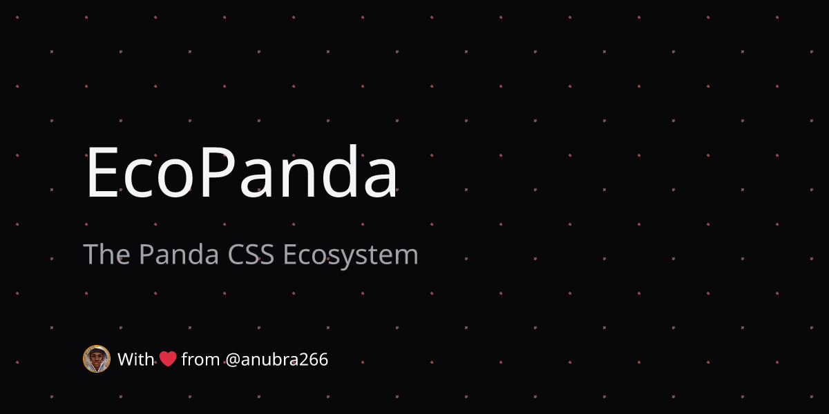
Lastly, Abraham also launched EcoPanda, a website that showcases community projects built with Panda CSS.
Honorable Mentions 🎖️
I'll like to appreciate other contributors who have played a role in shaping Panda at the early stages. Tim Kolberger, Lazar Nikolov, and Ivica Batinić.
Choosing the name "Panda"
On a lighter note, It took a while to find the name and domain for the project. I tend to take the "fun" approach to name a project.
I typically name projects based on cartoons, quotes or books I enjoy.
- Chakra: based on my favorite anime, Naruto
- Zag: based on my favorite quote "when everyone zigs, you zag."
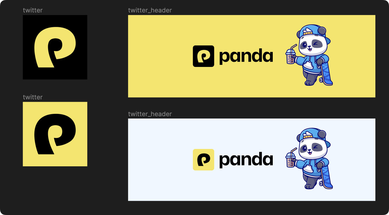
One night, I watched the popular Kung Fu Panda cartoon, which I absolutely enjoyed. I searched for domains related to "panda" and ended up with "Panda CSS."
Following the name choice, I designed the logo and branding for the project.
Check out the Panda CSS and use it in your next project.
Conclusion
If your team is looking to build a design system or SaaS product, I recommend using Panda CSS. We've put in a lot of effort to make it a reliable and robust tool for building design systems.
I'm absolutely delighted with the progress we've made with Panda CSS. It's been a journey of learning, collaboration, and growth. My key motivation for building open source projects is to leave a meaningful mark in the web technology space by solving meaningful problems.
Thanks for giving this a read. I hope you find our story inspiring and motivating to build your next project.
Keep shipping!