Panda v1 Roadmap
Segun Adebayo

Since the first release of Panda, we've been overwhelmed and encouraged by the community adoption and support. Thanks to everyone who has contributed to the project so far.
As we head towards the next major release, we're actively listening to the community feedback and requested features. We're working hard to improve the developer experience (DX) and performance of the library.
In this post, I'll share the roadmap to the `v1` release of Panda and their respective status.
Runtime JS Optimization (✅ Done)
Although the JS code emitted by Panda is lightweight, we focused on improving runtime performance of generated code and the rendering/updating time for components that use these functions.
We now achieved 2-3x faster runtime performance for generated code by avoiding excessive function calls.
Integrate LightningCSS (✅ Done)
We switched the internal style generation engine from PostCSS to LightningCSS. This helped with two things:
- Reduce the need to install several postcss plugins to get the same functionality
- Much faster css generation times. LightningCSS is fast!
- Automatic vendor prefixing and css optimization
You can try this today by adding the `lightningcss: true` flag to your `panda.config.js` file.
export default defineConfig({
  // ...
  lightningcss: true,
});
Panda Studio (⧖ In Progress)
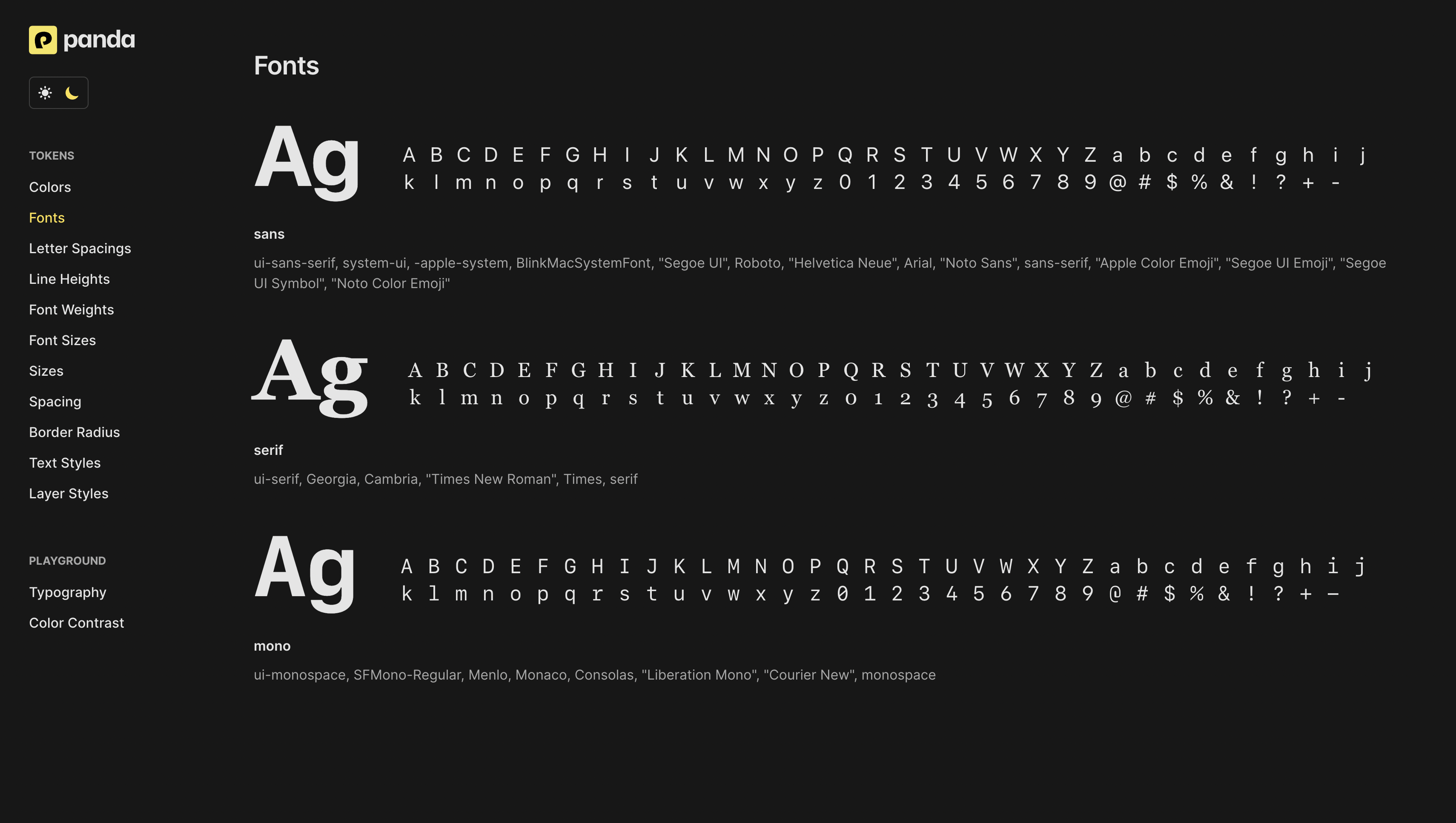
Panda Studio is a live Astro server that provides automatic documentation for your design tokens. The goal is to make it easy for teams to visualize and test their tokens without spinning up a Storybook story.

Using the studio will require an explicit installation of the `@pandacss/studio` package. This is to avoid bloating the core package with unnecessary dependencies.
# Install the studio package
pnpm add -D @pandacss/studio

# Start the studio server
pnpm panda studio

# Build the studio server
pnpm panda studio --build
This is a big step towards making design tokens a first class citizen in the design system ecosystem.
Color opacity Modifiers (⧖ In Progress)
Color opacity modifiers was popularized by TailwindCSS and it a great way to quickly tweak the transparency of a primitive or semantic color. We'll leverage the `color-mix` function supported in CSS to achieve this.
For example, when you
`bg: 'red.300/50'`, it means "50% opacity for red.300 color"
const className = css({
  bg: 'red.300/50',
  color: 'white',
});
This will generate the following css:
.bg-red-300\/50 {
  background-color: color-mix(in srgb, var(--colors-red-300) 50%, transparent);
}
Container Queries (⧖ In Progress)
Container queries are a great way to make components more responsive. It allows you to define styles that are applied when its parent container reaches a certain inline size range.
Today, you can write native container queries in Panda CSS like so:
<div className={css({ containerType: 'inline-size' })}>
  <div
    className={css({
      '@container (min-width: 300px)': {},
    })}
  ></div>
</div>
As you may have spotted, having to write `@container` and also hard-code `(min-width: 300px)` is a bit verbose.
We're looking to support container conditions and sizes in the panda config to provide much smoother DX. Here's what it could look like:
// 1 - Define container conditions

export default defineConfig({
  // ...
  theme: {
    containerNames: ['sidebar', 'content'],
    containerSizes: {
      xs: '40em',
      sm: '60em',
      md: '80em',
    },
  },
});
// 2 - Automatically generate container query pattern

import { cq } from 'styled-system/patterns';

function Demo() {
  return (
    <nav className={cq({ name: 'sidebar' })}>
      <div
        className={css({
          // When the sidebar container reaches the `sm` size
          // change font size to `md`
          fontSize: { base: 'lg', '@sidebar/sm': 'md' },
        })}
      />
    </nav>
  );
}
Config Validation
The panda config is a powerful way to customize the behavior of the library. However, it's easy to make mistakes when writing the config.
We're adding a validation step to the config to ensure that the config is correct before starting the compilation process. This validation logic will be applied to:
`conditions`: To ensure that valid css selectors and at rules are used`theme`: To ensure that the theme object is valid`breakpoints`: To ensure that the breakpoint units are the same units
Token Formatters (⧖ In Review)
Support for custom token formatters for className, token name and generated css variables.
export default defineConfig({
  // [red, 300] => $red300 (just like Stitches)
  formatTokenName: (path) => `$${path.join('')}`,
  // $red300 => red300 (ensure cleaner class names)
  formatClassName: (token) => token.replace(/\$/, ''),
});
Makes it possible to write Stitches-like styles, while generating cleaner class names.
const className = css({
  color: '$red300',
});
This is especially useful for teams that want to use a different naming convention for their tokens, or are migrating from libraries like Stitches.
Debug Log File
Debug log files are a useful way to track the execution path of the panda process by logging all internal `logger` calls to a dedicated file for the maintainers to inspect.
This for private projects that cannot easily create a reproduction for issues. We're looking to add this as a `--log-file` flag to the `panda debug` command.
pnpm panda debug --log-file

# ✨ Wrote debug log file to styled-system/debug/debug.log
Conclusion
Beyond this point, we plan to go for `v1.0`. For enterprise teams looking to migrate to Panda from Stitches, Styled Components, and Emotion, we think Panda is great replacement for these libraries.
For questions, collaboration, or feedback, join the Panda Discord community and share your thoughts.
