The future of Chakra UI
Segun Adebayo

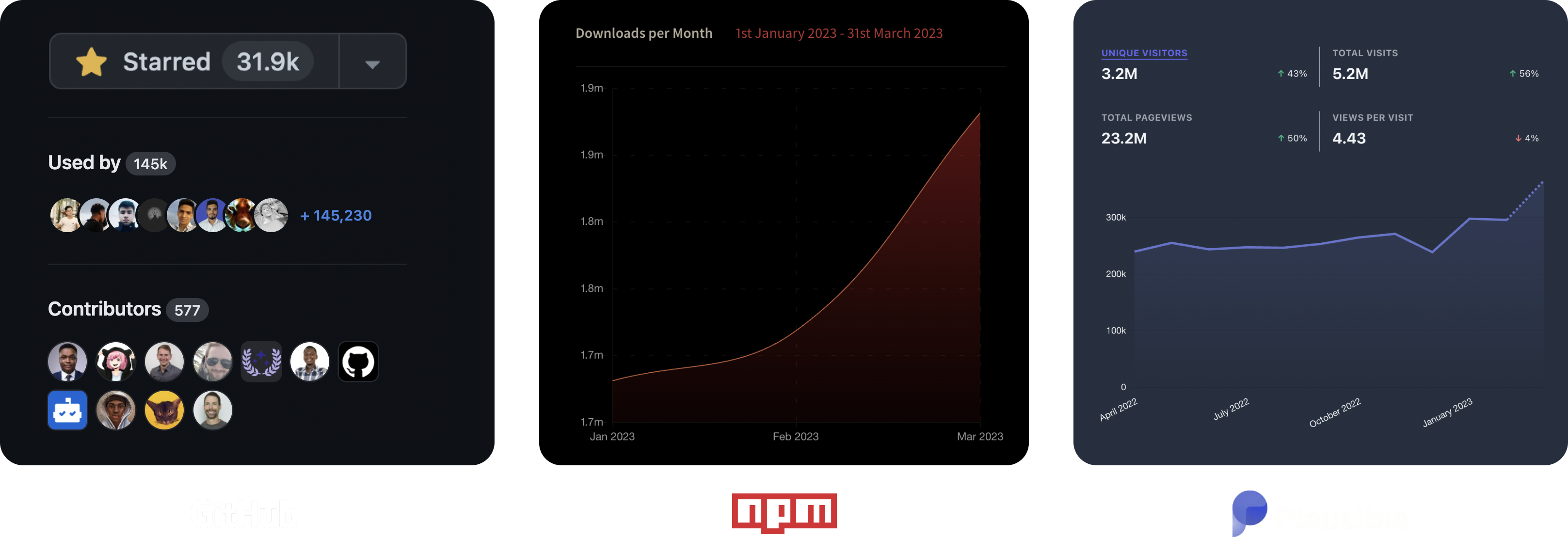
I've been working on Chakra UI for the past five years, and I'm very proud of what we've achieved collectively. With our growing team, we've achieved over 1.9M downloads per month, 2M unique website visits per month, and over 31k Github stars; this has been one of my most rewarding projects to date.
For a project that started with a single maintainer to become a multi-framework team, this has been a nerve-cracking, and exciting ride. Growing and managing the core Chakra team has been a great ride, and I'll do it again.

That said, let's take a look at what's next for Chakra UI. I'm so excited to share it with you.
Quick recap
At the inception of Chakra UI, my goal was to create bits of accessible UI components that can be composed to build complex UIs. I wanted to create a component system that anyone can use, regardless of their React skill level.
During this time, Styled System, Styled Components, and Emotion were the most popular tools for styling apps and design systems. Inspired by the work of Brent Jackson with Styled System, I leveraged a lot of ideas from it to build the styling foundations of Chakra UI.
// Here's a box
<Box>I'm a box</Box>

// if you want to its background red, you pass `background=red`. Feels intuitive!
<Box background="red">I'm a red box</Box>

// if you want to change the background on hover
<Box background="red" _hover={{ background: 'blue' }}>
  I'm a red box that turns blue on hover
</Box>
The super-intuitive, flexible styling system in Chakra UI is one of the most loved features of the library. Every time I use it, it makes me happy that a tool like Chakra exists (yes, even though I built it).
With the recent trends in the ecosystem around headless components, design tokens, and, server components, there's a shift in the expectations for component libraries and the landscape is changing.
I've been thinking about how to evolve Chakra UI and one of the most dominant thoughts is to transition it to become a "Design System Infrastructure". Let's get into it.
The Challenge
The major technical disadvantage Chakra UI has is its runtime CSS-in-JS due to the `@emotion/styled` dependency. This isn't unique to Chakra, but the same is true of other popular libraries like Material UI, Mantine, and Theme UI.
Getting rid of the runtime CSS-in-JS is one of the most common requests we get from our users, as it unlocks better performance, reduces the initial JS payload, and, enables the usage of Chakra in React Server Components (RSC).
So yeah, I probably have 80+ DMs asking: "Can you get rid of the runtime CSS-in-JS?"
Another common request is to add more complex components, like a date picker, custom select, nested menus, etc. Today, we have many React hooks that can be leveraged, but we've found that the cognitive load needed to understand how a component works increased significantly with new features or patches.
Designing an API for UI components and arriving at a solution that feels intuitive and easy to maintain is challenging.
That said, we're definitely working on a date picker and a custom select 😉
When working with larger teams with more senior engineering and talent, we see the need for a more robust theming solution that goes beyond only light and dark mode, and can enable multibrand solutions.
The most common request goes like this: "How can we integrate the token platforms like Figma Tokens or Style Dictionary with Chakra's theming solution?"
The Requirements
Thinking about the challenges, it's very easy to say "Sure, I can work on that" and dedicate loads of hours to build a React-specific solution that works. Bearing in mind that Chakra UI is now a multi-framework library, it means the same effort has to be duplicated in the Vue.js team. We've tried this in the past, and it's not a viable option as it leads to burnout and inconsistent DX.
I've found that the best way to tackle these challenges is to break them down into smaller, more manageable pieces. In the spirit of engineering, defining the requirements is the crucial first step to solving a problem.
Here are some of the requirements we have for the future of Chakra UI:
-
Framework agnostic: Chakra UI is a multi-framework library. It's used in React, Vue, Angular, Svelte, and, Solid. This means that any solution we build has to be framework agnostic.
-
Design Tokens: The theming system in Chakra UI is very simple and works well for most use cases. However, it's not flexible enough to support more complex use cases.
-
Style Props: The style props in Chakra UI are very intuitive and easy to use. We need to keep this experience while also removing the runtime with CSS-in-JS.
-
Reduce Maintanance Workload: If architected correctly, we can reduce the maintenance burden of the library by splitting the concerns into smaller, more manageable pieces.
Phewwww! That's a lot of requirements. Let's see how we're currently approaching them.
The Approach
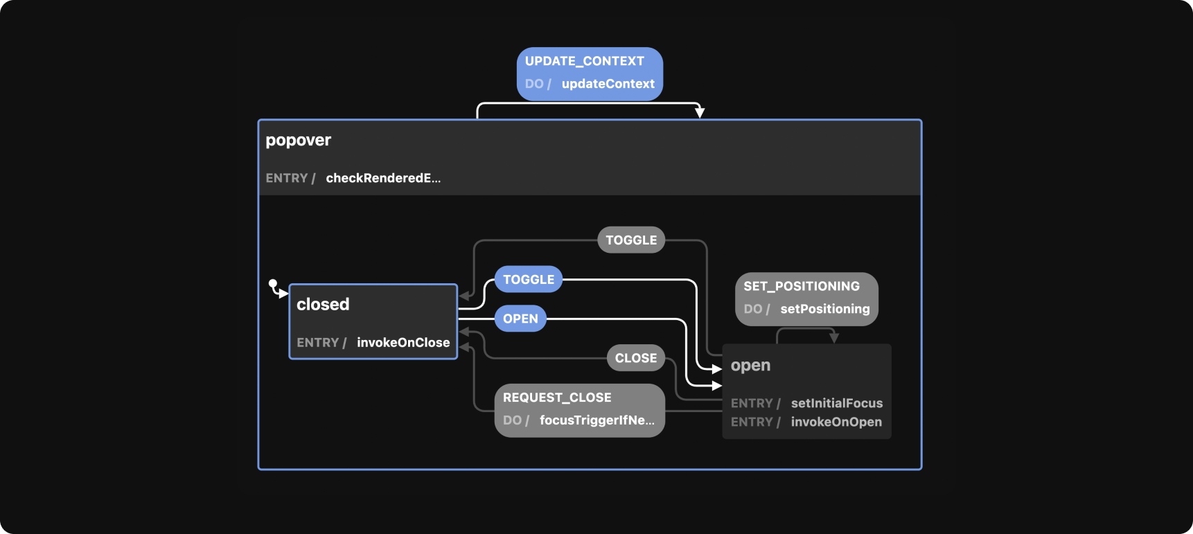
In mid 2022, I picked an interest in State machines and XState because they deliver a compelling promise. You can model any complex system once and re-use it everywhere. They also provide a great way to visualize and debug the statecharts.
This led me down the "curiosity hole" and I came back with a working on a new library called Zag.js, which is a low-level state machine for building UI components.
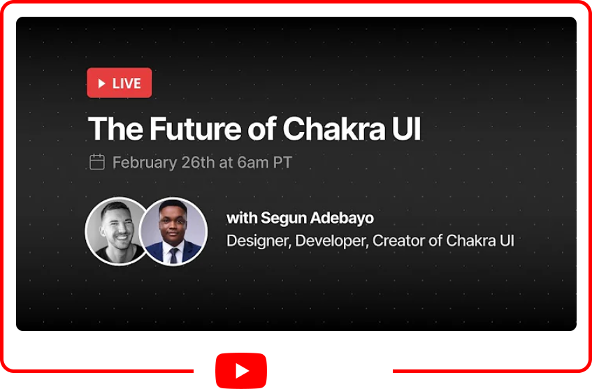
I made a video with Lee Robinson where we talked about the future of Chakra and what we're planning to do next. You can watch it here: https://www.youtube.com/watch?v=I5xEc9t-HZg
At this point, I had no idea how we were going to achieve that but it became clearer when I built a proof of concept for some of the components in Chakra UI using XState.
Breaking the monolith
Currently, I consider Chakra UI a big monolith of different concerns. We've got react hooks, components, theming system, styling system, polymorphic types all tightly coupled together.
Over the years, this has raised the barrier to understand or contribute to the codebase. It takes a considerable time to fully understand how each part fits together, making triaging and bug fixing longer than necessary.
To reduce the complexity, we're splitting up the big ideas in Chakra into smaller, manageable and independent projects. Here's a quick overview:
- Styling system: Zero runtime CSS-in-JS system that supports style props.
- Design token: One place to author, document and automate design tokens.
- State machines: Model component logic once, re-use everywhere.
- Headless UI components: Framework specific wrappers for the state machines. Think Radix UI for all frameworks.
Zero runtime CSS-in-JS [Panda]
This is the most common and most challenging request we get from users.
Runtime CSS-in-JS and style props are powerful features that allow developers to build dynamic UI components that are composable, predictable, and easy to use. However, it comes at the cost of performance and runtime.
With the release of React Server Components, providing the ability to write Chakra UI components on the server has become crucial. This is a huge win for performance, development, and user experience.
We're building a new, framework-agnostic styling solution that keeps most of the great features of Chakra's styling system but extracts styles at build time. It'll also feature a PostCSS plugin that extracts styles at postcss run time during development.
Panda will leverage new modern platform features like CSS variables, cascade layers, and W3C token spec.
This project is still in the early stages of development. If you'd like to test it out and help us improve it, please reach out on Twitter or email me at [segun@chakra-ui.com]
State machines for Components [Zag]
Every interactive component in Chakra UI will be modeled as a state machine. Our core principle is that most components should function similarly regardless of the framework.
State machines allow us to carefully architect the states and transitions of the component logic. This approach will enable us to build easily debuggable, predictable, and maintainable components.
Zag.js is our low-level state machine library used to build all the components in Chakra UI. We aim to develop a robust set of application and e-commerce components that works in most JS frameworks.
To learn more about Zag.js, check out the docs here: https://zagjs.com, or you can watch my demo on the Learn with Jason show here: https://www.youtube.com/watch?v=l8HJoE_ktDc

Here's a quick example of how we can build a number input component using Zag.js using React:
// 1. Import the state machine
import * as numberInput from '@zag-js/number-input';

// 2. Import the React bindings
import { useMachine, normalizeProps } from '@zag-js/react';

export function NumberInput() {
  // 3. Consume the machine
  const [state, send] = useMachine(numberInput.machine({ id: '1', max: 50, min: -50 }));

  // 4. Convert machine to a user friendly API
  const api = numberInput.connect(state, send, normalizeProps);

  // 5. Render the component
  return (
    <div {...api.rootProps}>
      <label {...api.labelProps}>Enter number:</label>
      <div>
        <button {...api.decrementButtonProps}>DEC</button>
        <input {...api.inputProps} />
        <button {...api.incrementButtonProps}>INC</button>
      </div>
    </div>
  );
}
Moving to a headless component system [Ark]
Building UI components with State machines sounds exciting but can sometimes sound complex or scary. It sometimes gives the impression that you need to know, or at least learn, about state machines before you can use them. That's not the case (at all).
To increase adoption, we're wrapping Zag.js component logic into a headless component library you can use to build your applications and design systems with speed.
import { NumberInput } from '@ark-ui/react';

export function Demo() {
  return (
    <NumberInput min={-50} max={50}>
      <NumberInput.Label>Label</NumberInput.Label>
      <NumberInput.Field />
      <NumberInput.Control>
        <NumberInput.DecrementTrigger>
          <button>-1</button>
        </NumberInput.DecrementTrigger>
        <NumberInput.IncrementTrigger>
          <button>+1</button>
        </NumberInput.IncrementTrigger>
      </NumberInput.Control>
    </NumberInput>
  );
}
We created a new library called Ark, which will be the headless component foundation for Chakra UI.
It's open source and you can check it out here: https://github.com/chakra-ui/ark
How does Ark fit in Chakra UI?
- Zag.js: low-level state machine for UI components
- Ark: Headless components based on Zag.js (Most for improved DX)
- Chakra: Ark + runtime CSS-in-JS
When Panda is production-ready, we'll recommend switching to Ark and Panda for new projects.
Design token platform [Ultra]
Design tokens are quickly becoming the standard for managing design decisions in a product or website today. They're a powerful concept that allows you to build a design system that is flexible, scalable, and maintainable.
Chakra UI today supports a theming system that allows you to customize design tokens and components at any level of granularity. We also added basic support for semantic tokens to enable developers to build automatic light and dark modes into their applications. Most enterprise applications require more than just light and dark modes.
Beyond authoring design tokens, transforming and distributing tokens to different platforms and projects is a huge pain point for most design systems.
We're building Ultra, a SaaS platform that will allow product teams:
- Create core and semantic design tokens visually (without it feeling like grunt work)
- Define best practices, shared layers and text styles across your project
- Provides automatic documentation for your tokens with a GPT interface for searching and filtering
- Distribute design tokens to different platforms and projects
If you're interested in learning more, investing, or sponsoring this project, please reach out on Twitter or email me at [segun@chakra-ui.com]
What should I use in my project?
-
If you're building a design system and want control over the API design, styling, and bundle size, use Zag.js
-
If you're building a design system and want to focus on the design and UX, use Ark.
-
Use Chakra if you're building an application and want pre-made UI components with good default styling you can enhance over time.
-
If you're okay with runtime CSS-in-JS, use Chakra UI (It comes with Ark and our current CSS-in-JS solution)
-
If you're not okay with runtime CSS-in-JS, use Ark and Panda
Conclusion
We have a lot of work in progress, and we're excited to share them with you. Our ultimate vision is to build a design system infrastructure for product teams.
If you're interested in contributing, investing, or sponsoring Chakra, please reach out on Twitter or email me at [segun@chakra-ui.com]
Cheers to the future of Chakra UI!